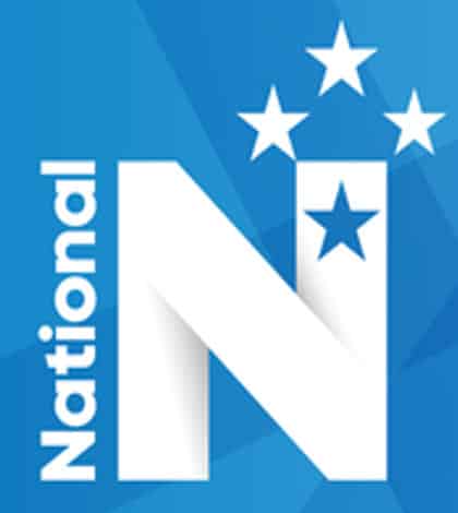
I am learning to about the National party and their new logo!
The National Party has released it's new logo in preparation for this year's general election. Now that the National party have a new leader, Bill English, he has come up with the new design for his party now that John Key has resigned from his position as PM and National party leader.
The new design has the letter 'N' in the middle with different shades of blue in the background.The party's social media and website have switched over to a design. The new logo is a marked departure from the previous logo.

Which design do I like more than the other?
This is based on my own opinion but I think that the old design is better then the new one, I think this because the old design had the national colours of the New Zealand flag while the new design just has 2 colors, Blue and White. I didn't think that National had to change their design but it's not up to me it's up to Bill English now that former PM John Key resigned.
VS

I don't see a point of changing the logo for the party because National is National and nothing can change that. But the decision isn't mine so I have nothing to worry about.
If you want to read this article yourself, click here
Here is my reflection about the release of the new logo of the National party.
Bill English has come up with a new logo for the National party, I didn't think he should've changed it because I don't see a point.
Something I found challenging during this task was coming up with more ideas because the article wasn't that long. But something that I enjoyed during this task was being able to give my opinion on this decision. My next steps in learning is to pick an article that give in depth information not just 1 or 2 paragraphs.
Thanks for having the time to read my reflection!
Many thanks!
0 comments:
Post a Comment